The Stevens Architectural Glass Competition 2016
New Design
Sarah Knighton was awarded 1st prize – The Brian Thomas Memorial Prize. She received a further Prize for quality of Presentation.
Gemma Curtis was awarded The George and Evelyn Gee Prize for Craftsmanship.
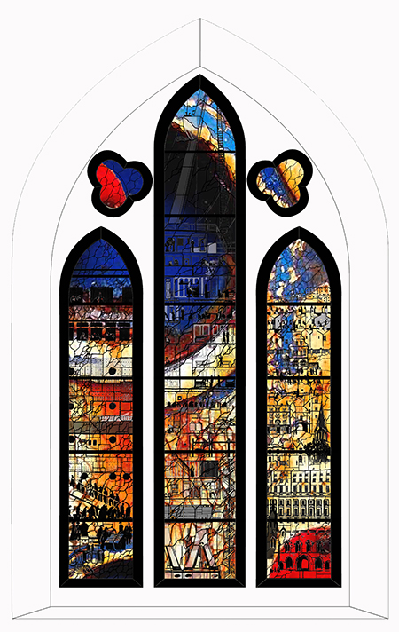
The Worshipful Company of Glaziers & Painters of Glass (‘The Glaziers Company’) is one of the City of London’s medieval Livery Companies, or craft guilds, and has been running the prestigious annual Stevens Architectural Glass Competition since 1972. It is open to student glass artists and designers, and also those who have completed their training within the last five years. In 2016 the theme of the competition was to design, with a view to manufacturing and installing, a Memorial Window dedicated to the Crew of the RMS Titanic at St Mary’s Church, Southampton, providing a focus for reflection to enable contemplation on the primacy of love in the face of disaster. It was supported and sponsored by St. Mary’s Church and British Titanic Society. The window design was specifically intended to be sited in the second window of the north aisle (nVIII) in clear view from the main entrance to the church. It is a three light window with simple lancet form main lights, and two trefoil tracery elements. It was asked that the quotation from the Old Testament book Song of Songs, chapter 8, verse 7 – ‘Many Waters Cannot Quench Love’ – should be incorporated in the design together with the emblem of the White Star Line, the company which owned the ship. Other than that the design brief was open. The finished design was to be on a scale of 1:10, supported by an explanatory statement, as well as a full scale sample panel (465mm width x 465mm height).
Design 1 – Sarah Knighton: Explanatory statement
This design is a memorial to the crew that died in the Titanic disaster and the effect on the community of Southampton, particularly the poor working classes. The design is intended to act as a vehicle for introspection and contemplation. The overall colour effect is to uplift and be vibrant, whereas the details are partially hidden to be discovered upon study. The left hand light is ‘the farewell’ showing the crew boarding. The middle light depicts a slice of ship life with different levels of the Titanic and the range of duties performed by the crew. The right hand light reflects Southampton and the effect of no return. The buildings are layered to show the gradation of society and incorporate landmark buildings, the focus of which is the White Star Line office and the lists of survivors that relatives anxiously read. Overlaying the detail is the theme of rust and decay showing in the colour and lead lines, which is a reflection of how time affects our memory and feelings of disaster and its effects. The style and narrative of the figures is dark abstract outlines to convey that feeling of removal, separation, and also of decay. The colour red is symbolic of disaster.
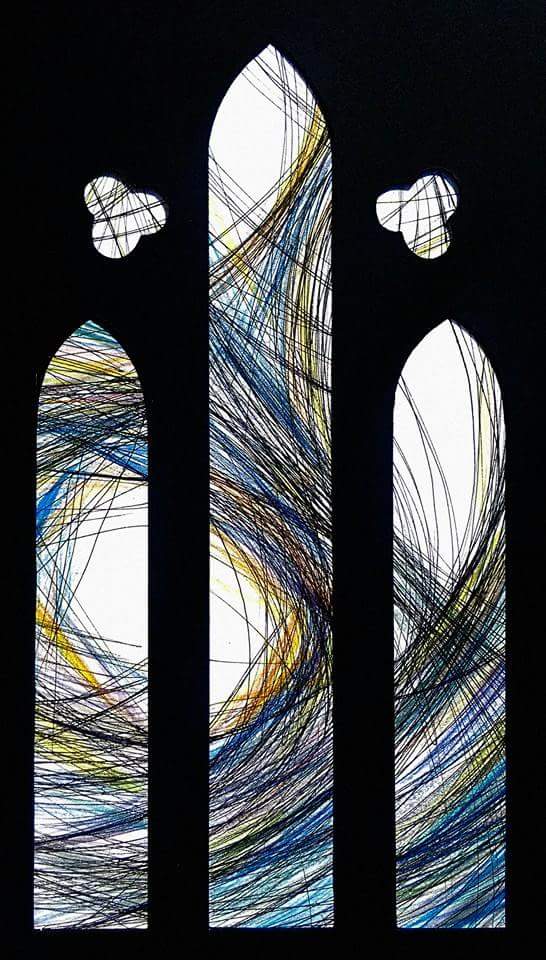
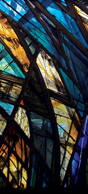
Design 2 – Gemma Curtis: Explanatory statement
This window has been designed to commemorate the crew members who died in the Titanic disaster and the family they left behind. The design uses traditional stained glass techniques such as glass painting, acid etching, and lead, paired with a contemporary style. The entry is based on my emotional response to researching the disaster. My intention was to create extreme movement within the window, with the use of varied lead lines and paint. Although the design is quite dramatic, I have translated the feeling of hope in conjunction with this. I’ve chosen sombre colours alongside warmer colours to bring it all together, and included some close-up details of crew members’ names scratched into the glass paint. Having an abstract design, I found, left a lot of room for extra details to be added without being distracting. The process of making this test panel has been endlessly informative in terms of glass choice and other craft skills like glazing, plating, and acid etching.